Spanish Eclectic To New Modernism - SF Architecture from 1915 - Today
San Francisco has a wonderful variety of architectural styles that grace our streets – it’s not unusual to see half dozen distinct types of architecture on a single block. Here is a brief overview of home architecture from 1915 through today. You can view the Victorian & Edwardian post here. The text and photos are all courtesy and permission of the San Francisco architect James Dixon: James Dixon Website. I am most grateful for his generosity in allowing me to use them.
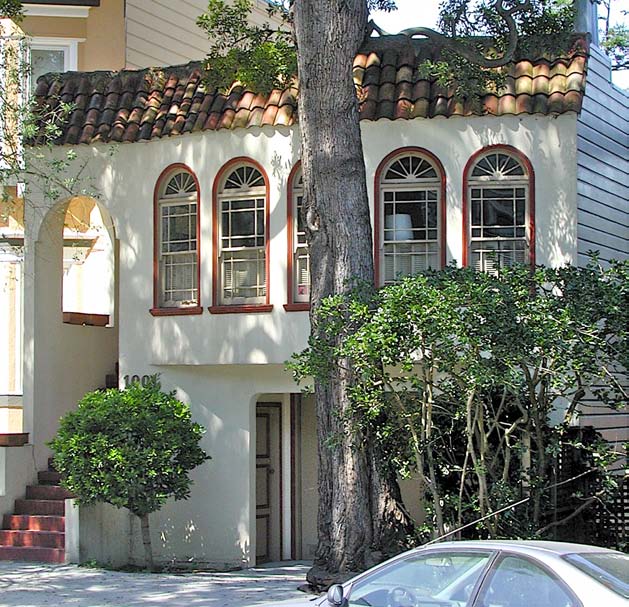
Spanish Eclectic / Mediterranean Revival Spanish - 1915 - 1940

Eclectic styles were not codified until the 1915 Panama Pacific International Exposition (PPIE). The purpose of the PPIE was to celebrate two things: the opening of the Panama Canal and the rebirth of San Francisco after the 1906 earthquake.
The land for the PPIE was reclaimed from sand dunes and the bay. A fantasy city was built and then razed after its ten month run. This wasteland was idle for 5 years until the 1920s when builders converted that reclaimed land into the residential tracts of what would be called the Marina District.
The codified styles of Spanish Eclectic are Spanish Revival and Spanish Colonial. Spanish Revival homes look like they belong in Spain, while Spanish Colonial buildings are less refined and look like they
belong in a Spanish colony. Some of the more idiosyncratic examples of Spanish Eclectic predate 1915. These transitional homes freely mix elements of Spanish Revival, Spanish Colonial, and Mission Revival. San Francisco has Spanish Eclectic of both sorts: those that predate 1915 and those that came after the stylistic codification.
One of the other codified styles is Mediterranean Revival, it is another freely-mixed style that was popular with San Francisco builders and the buying public. Thousands of Spanish Eclectic and Mediterranean Revival homes were built in the Marina District and the Sunset.
Art Deco - 1920-1940
 Art Deco takes its name from the Exposition Internationale des Arts Décoratifs et Industriels Modernes (International Exposition of Modern Decorative and Industrial Arts) held in Paris in 1925. The Expo and its style intentionally rejected the past that had fomented the no-man’s-land moonscapes and gas-filled trenches of World War 1.
This new style and the new age would reject aristocracy for democracy, frugality for luxury, and European architectural references for futuristic geometric ornament (or exotic ancient non-European styles).
The term “Art Deco” makes it clear that it is a decorative style of applied ornamentation, and its friendly abbreviated nickname shows that it doesn’t take itself too seriously or pretend to have deep intellectual roots. The name itself, like the flapper dress that freed women from bulky yards of fabric in previous eras, is short, simple and exudes a healthy appreciation of the brevity of life.
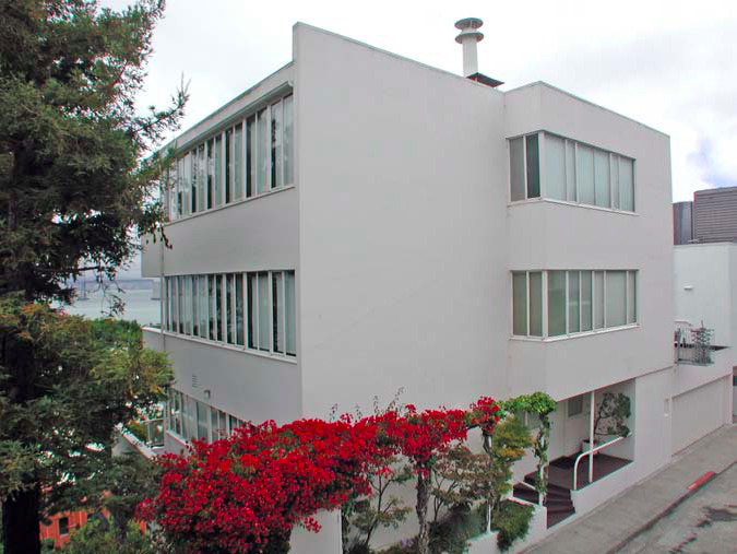
International Style - 1925 - Present
 Mies van der Rohe’s pithy maxim “Less is more” appropriately condenses the lean and functional International Style into three short words. Mies was one of three gifted architects who learned functional design from the industrial architect Peter Behrens in Germany; the other two were Le Corbusier and Walter Gropius.
Le Corbusier and Gropius admitted that they were influenced by an article published in 1920 by Austrian architect, Adolf Loos, Ornament und Verbrechen (Ornament and Crime), that advocated the suppression of ornament in functional objects, but was misinterpreted by architects as advocating the radical elimination of all architectural ornament. Loos was shocked and wrote another article to refute that misinterpretation but the damage was done.
After converting to the heady and misinterpreted apostasy of Loos, Le Corbusier wrote a series of articles from 1921 to 1923 for L’Esprit Nouveau. This magazine was widely read by wealthy prospective patrons and had published Loos’s article in 1920.
In 1923 Corbusier collected his series of essays into book form, wrote a polemical preface for its intended audience of architects, and published it as Vers Une Architecture (Towards An Architecture). It rationalized the romance of gargantuan ocean liners, airplanes, and automobiles, and set modern engineering and unadorned honesty, pure function and pure form, as the only true standards of architecture. The book’s influence was, and continues to be, gargantuan. Corbusier’s most famous dictum, “A house is a machine for living” still influences architects today. He published his recipe of five simple ingredients for achieving the style. Stripped-down machine functionalism, pre-cooked and by-the-numbers, reigned supreme and was here to stay. Buildings would look the same whether they were on India’s scorching plains or San Francisco’s foggy hills, in a Palm Springs desert or an Illinois swamp. Everything, everywhere, by everyone, would be the same.
Streamline Moderne - 1930-1950
 As Art Deco matured and the Great Depression limited large projects a new simpler style evolved from the basic tenets of Art Deco. This new style was Streamline Moderne.
Both styles rejected the past, but did it differently. Art Deco was a transport to another time—an exuberant fantasy future or an exotic non-European past—while Streamline Moderne was a transport to another place. It was a romance of efficient travel by ocean liner, airplane, train, and car.
Efficient travel meant streamlining. The new science of aerodynamics rounded edges, assisted air flow around corners with horizontal grooves, and smoothed surfaces so they were unencumbered and sleek. Think of the travel posters of that era.
Stationary buildings sprouted portholes, extruded horizontal streamlining bands, grew wings over doorways, curved windows around corners, and shed the exotic historical ornament of Art Deco in favor of a sleek skin. Buildings became romantic ships and airplanes to and from another place.
Bay Area Modernism: Second Bay Area Style - 1930 - 1960
 Bay Area Modernism influenced more homes throughout America than all other architectural styles combined; any numerical comparison is not even close. The vast tracts of post-World War II suburban ranch houses are linked directly to the prototypes developed by the Second and Third Bay Area Styles.
After the First Bay Area Style of Willis Polk and Bernard Maybeck in the 1890s, William Wurster picked up the baton in the 1920s and founded the Second Bay Area Style—although it was not called that at the time. Wurster was a California native who, with like-minded architects, combined a love of California landscapes and its rural buildings with the elemental quality of minimalist Japanese architecture. Their goal was inexpensive homes that allowed the outside in and were easily built of local materials.
A style born of California’s climate, natural beauty, and Pacific Rim culture would be very different from a style born in Germany or France. So different that the famous architectural critic, Lewis Mumford, coined the term “Bay Region Style” for a 1947 exhibition and said the “exhibition repairs a serious omission in the existing histories of American architecture: it establishes the existence of a vigorous tradition of modern building, which took root in California some half century ago...[the style] was thoroughly modern, it was not tied to the tags and clichés of the so-called International Style: that it made no fetish of the flat roof and did not deliberately avoid projections and overhangs: that it made no effort to symbolize the machine, through a narrow choice of materials and forms: that it had a place for personalities as different as Maybeck and Dailey and Wurster and Kump.” Mumford was held in such high regard that his poorly punctuated run-on sentence ran unedited and his neologism defined the style.
Bay Area Modernism: Third Bay Area Style 1950-1980
 As the Second Bay Area Style matured, architects tired of its plainness and flirted with playful pop culture and Postmodernism. Seduced by facile ideas and superficiality they started the Third Bay Area Style and influenced acres of tract homes throughout the US.
The main inspiration of the Second Bay Area Style—simple wood clad California rural buildings—was kept and updated, as David Gebhard noted, “with a renewed pop art appreciation of the constructor / builder’s vernacular. In their buildings they tended to turn the horizontal Second [Bay Area Style] buildings on end and to introduce vertical spatial complexity.”
Architect Andrew Batey takes the explanation further, “I think [Joseph] Esherick was the turning point, in that he broke down the overt modesty of William Wurster and started playing with the elements.”
Two ideas of Postmodernism played with in the Third Bay Area Style were “Decorated Shed” and “Building as Billboard.” In a typical example shed forms were jammed against each other, usually offset to display their “shedness,” and clad with wood boards that were a “billboard” for the idea of a “farm house” or a “barn.” Wood boards were most often run vertically, sometimes diagonally, less often horizontally. Wood shingles were also used. Banal homes of 1960s and 1970s have a San Francisco pedigree.
Eichlers - 1950 - 1970
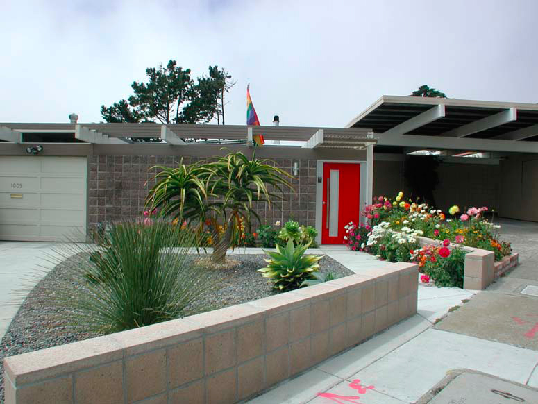
 Joseph Eichler was a visionary developer who believed that modern architecture would benefit America’s middle class. He backed up his belief by hiring some of the best modern architects of the time to design his post-World War 2 homes.
Frank Lloyd Wright was Eichler’s most desired architect but was unobtainable. Undeterred, Eichler hired Wright’s disciple Robert Anshen, partner in San Francisco’s famous firm of Anshen and Allen, to design the initial homes in 1949. Eichler would later hire other famous architects and build over 11,000 homes in Northern and Southern California.
All the homes would display Wright’s core ideas of breaking the box, bringing the outside in, radiant heated concrete floors, floor to ceiling glass, simple natural materials kept exposed, and the open floor plan. These ideas made Eichler homes airy and modern, in great contrast to the boxy warrens of most post WW2 homes. However, to keep costs down and to satisfy the International Style aesthetics of his non-Wright architects, Eichler homes would eschew Wright’s use of integral ornament for Mies van der Rohe’s unadorned simplicity.
The style that would bear Eichler’s name is rooted in San Francisco and the California hills. The public was slow to adopt his homes and it is only recently that they have become popular.
Postmodernism - 1960-2000
 To Mies van der Rohe’s modernist maxim “Less is more” architect Robert Venturi famously riposted “Less is a bore.”
Venturi’s 1966 book Complexity and Contradiction in Architecture rejected International Style modernism and, at its best, freed architects to borrow freely across architectural styles in search of appropriate “contextualism.” At its worst it allowed and applauded cardboard-thin “quotes” of “super-sized” architectural elements pasted to boring boxes.
Postmodernism’s highest goal was contextualism— to make buildings fit in the local fabric and respect their neighbors—the opposite goal from the International Style.
New Modernism - 1980 - Today
 Rather than react to the International Style with Postmodernism’s cartoony kitsch, other architects searched for new answers in Modernism’s seminal buildings and in human nature. These efforts grew into the branches of New Modernism.
One branch took Wright’s powerful phrase “breaking the box” literally and crumpled and exploded non-rectilinear forms. This branch produced the short-lived Deconstructivism movement that devolved into intentionally bizarre forms that would have very little to do with the building’s structure, use, or inhabitants.
Another branch mimicked Modernism’s seminal buildings but updated them with new materials and new technology, exaggerated the scale of some of the elements, dunked the parts into a crayon vat and glued them together. Ironically, this branch copied building forms of the past—an idea abhorrent to the original modernists—and colored them like the Postmodernists.
Humane Modernism is another branch. Its buildings use modern materials, technology, and computer modeling for a higher purpose than energy efficiency or structural daring. Its buildings strive to be humane; a radical concept in modern architecture that up to this point had revered machines, not humanity, and had rejected nature, not embraced it.
Humane Modernism’s aesthetic is contemporary, but it is warm, tactile, colorful, and durable. It uses the best traditional building methods to increase the everyday quality of life of the inhabitant—such as local sustainable materials beautifully detailed and exposed to view, and roof overhangs that actually shade the windows.
Additional Information
The links below go to architect James Dixon’s complete overview, which was the basis for this article. It features short videos on each of the different styles mentioned above.
James Dixon on San Francisco Victorian and Edwardian Architecture
James Dixon on San Francisco Architecture 1920 to Present
And for those who find San Francisco history as interesting as I do, here are two other websites I've discovered that are filled with fascinating photos and stories:
FoundSF: History, Stories & Images
OldSF: San Francisco Photographs, 1850-2000